Shouts: Helping Students Find Their Ideal Study Spots
UX Design — Mobile
Some students like busy areas for studying. Others, not so much.
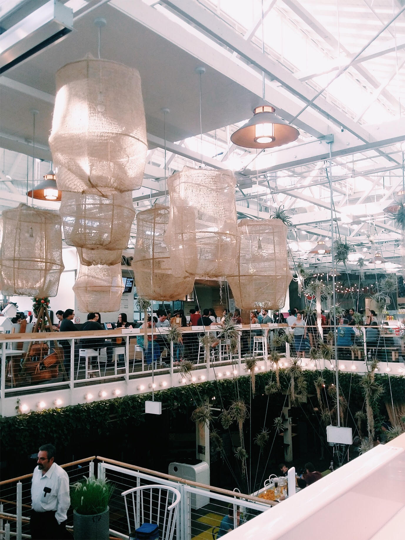
Anaheim Packing House, 2016
UX Design — Mobile
Some students like busy areas for studying. Others, not so much.
Anaheim Packing House, 2016
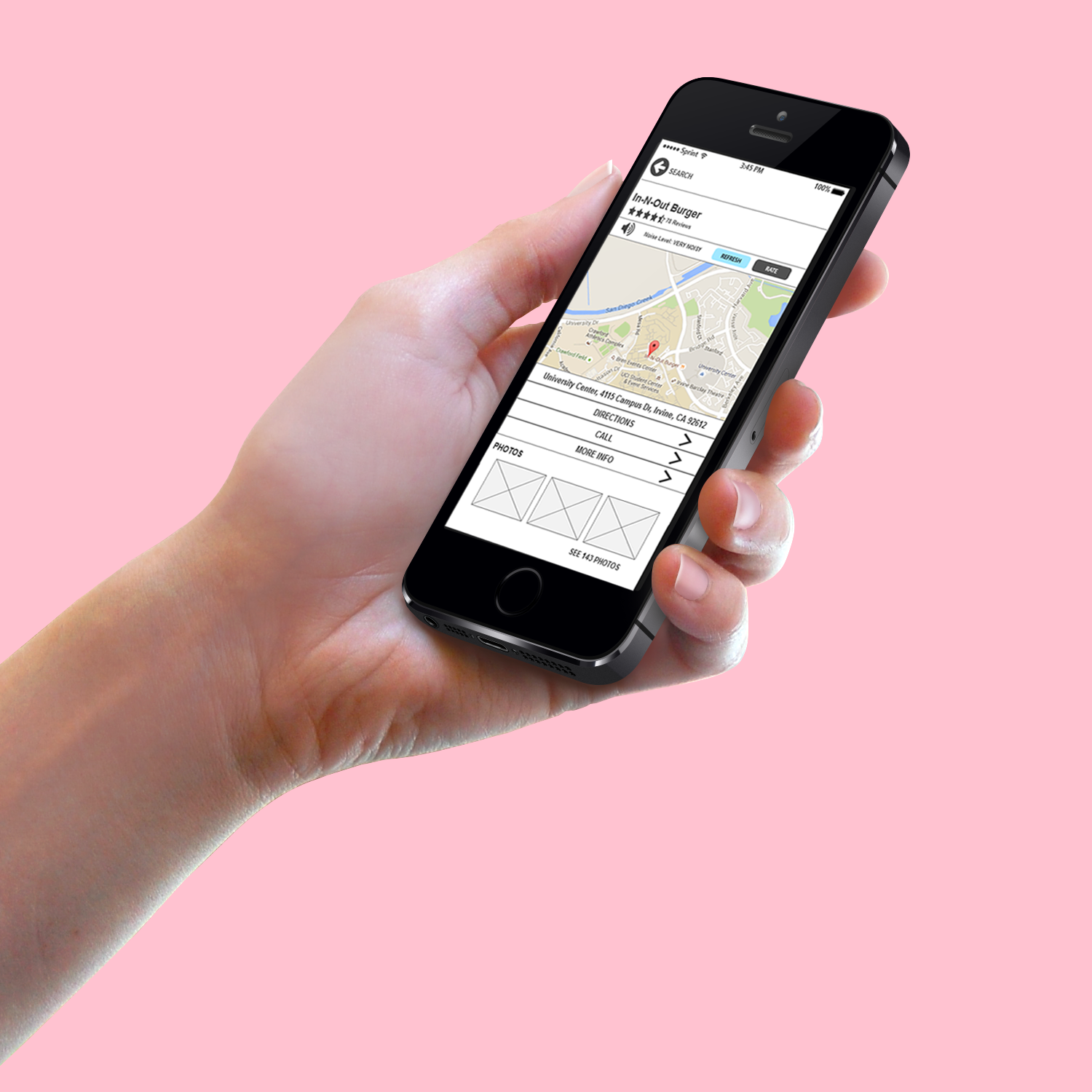
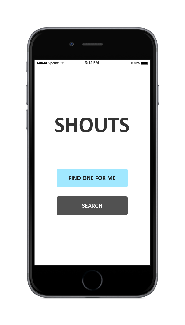
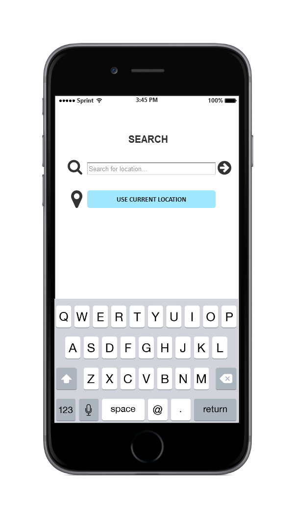
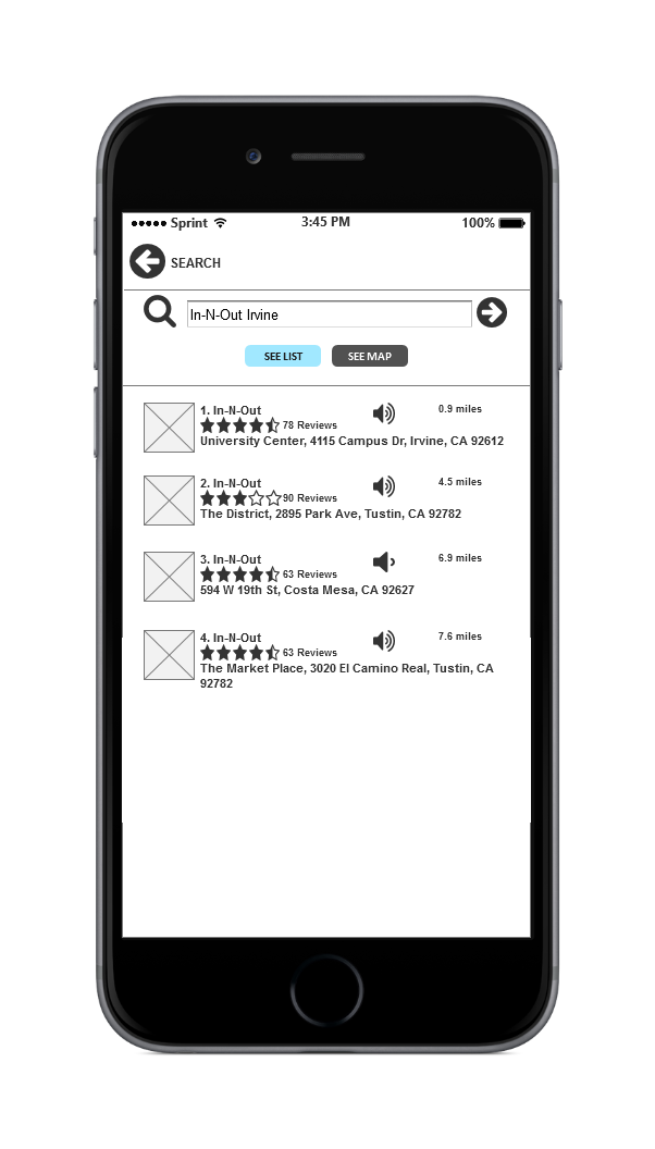
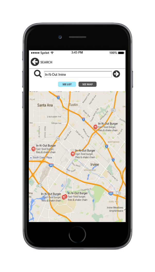
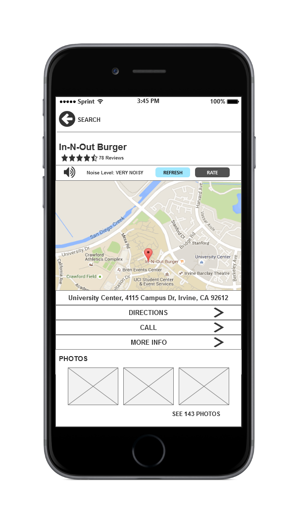
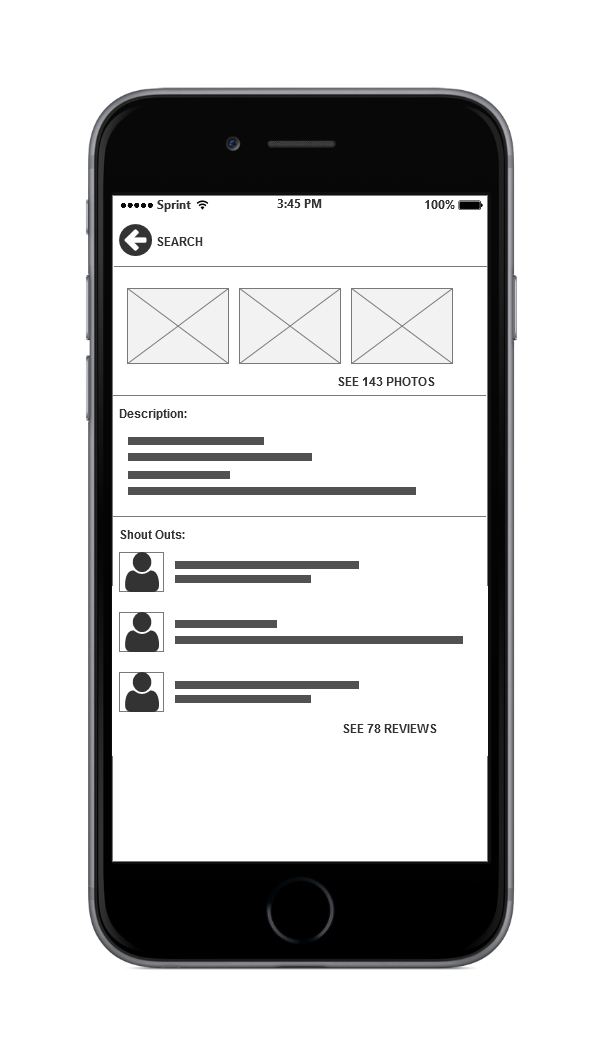
Shouts is an app that helps UCI students find their ideal study spots on campus. A student could either manually search for a spot (ex: Starbucks, library, etc.) or have the app suggest one based on proximity. Each location has a noise-level rating (ex: quiet, very loud) which is reported by students who are currently at that spot.
I worked on this project with three peers from my Human-Computer Interaction class at UC Irvine. Together, we conducted research, sketches, and testing. I delivered the personas and wireframes.
For this project, we followed the Design Thinking method from the Stanford d.school. We were tasked to design a solution for the following problem:
How can we increase student productivity when it comes to studying?
To begin, my team and I:
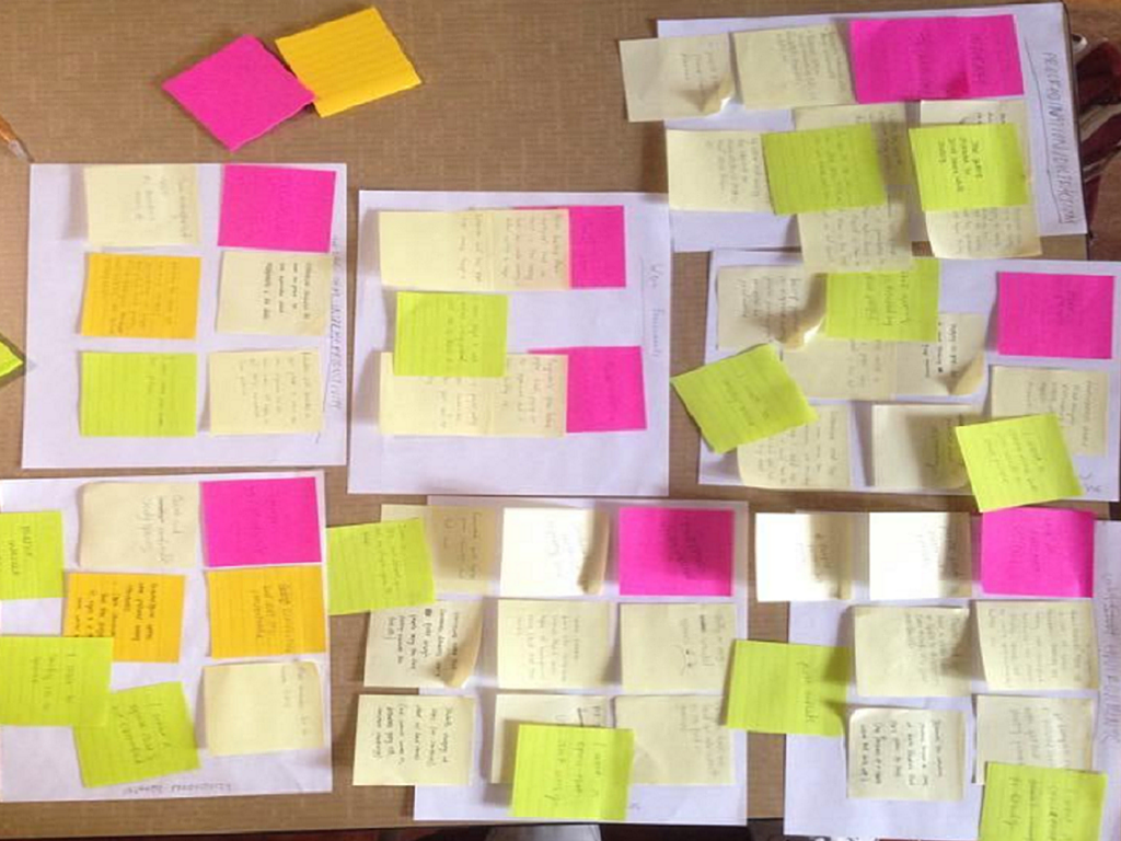
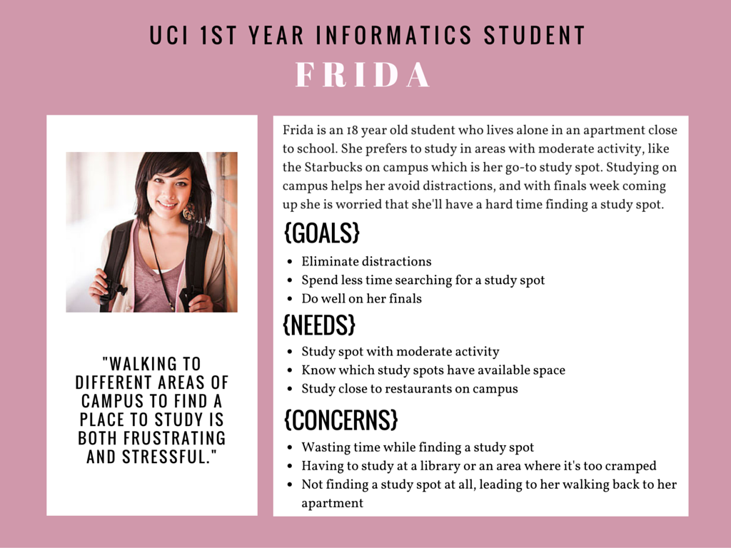
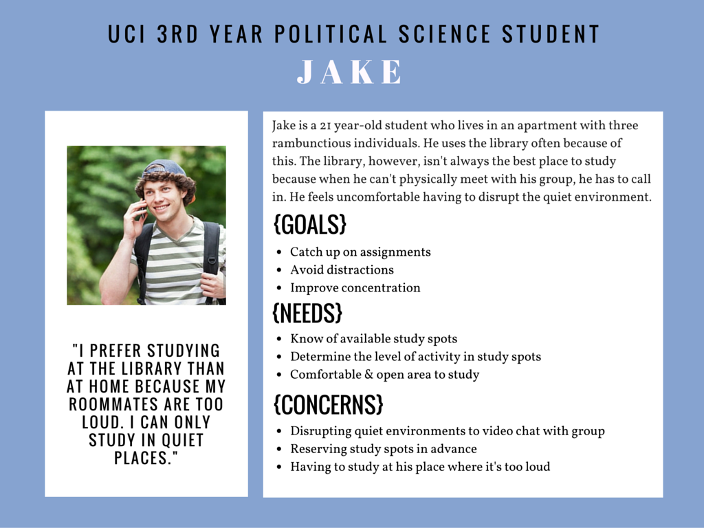
The steps above were taken to understand our user within the context of our design problem. Below are our UX deliverables: an affinity diagram, an empathy map, and my two personas.
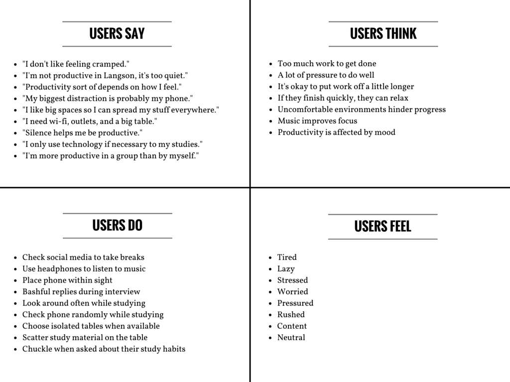
We found that the underlying issues related to ineffective studying were space availability and noise levels. The data collected told of students having trouble finding open spaces to use and having to study at locations that weren't suitable for them.
We proceeded to brainstorm possible solutions to our problem. There were no limits, every idea was considered.
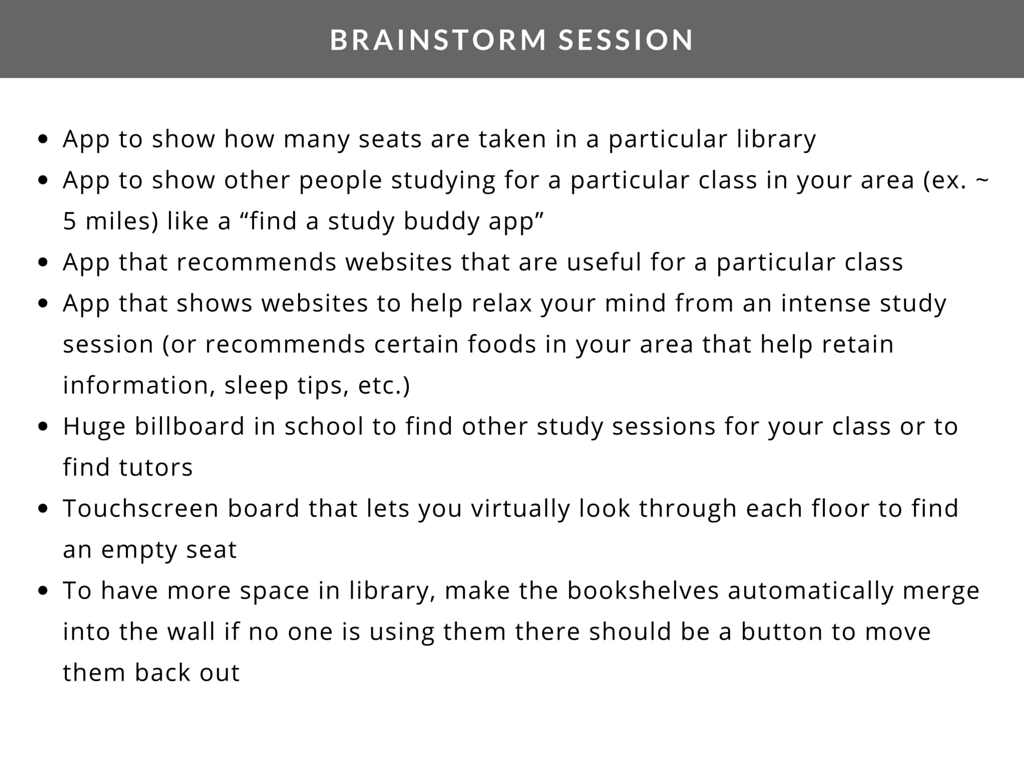
We concluded that our solution must assist students in quickly finding their ideal study space so that they don't waste time searching across campus.
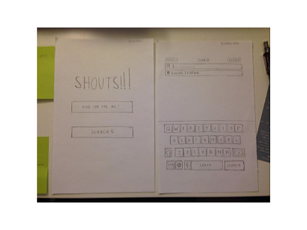
We designed an app that determines the noise level of a location, thus accommodating students with their preferred study environment.
We created and tested a lo-fi prototype of our app with cognitive walk-throughs, a Heuristic Evaluation, and think-alouds with UCI students. We asked them for feedback about the accessibility and layout of the content. Here are the responses:
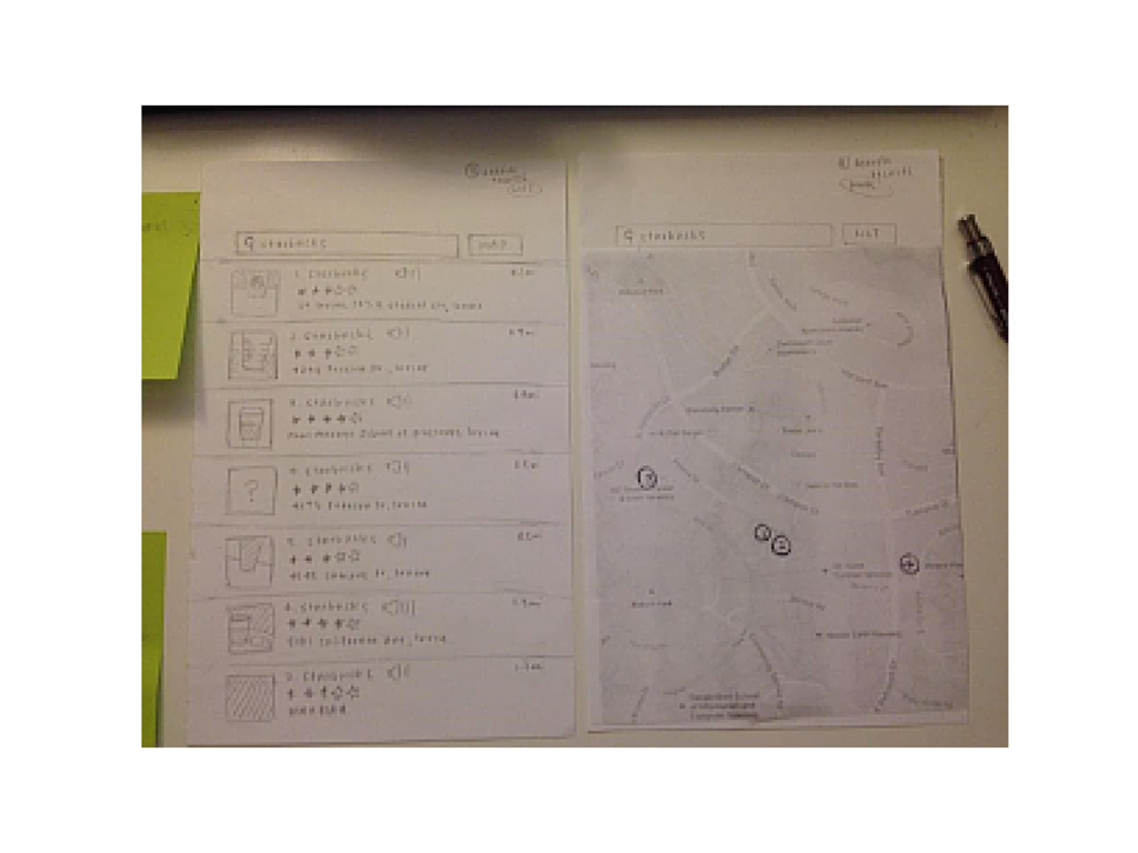
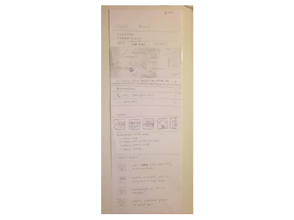
The delivery of the lo-fi prototypes marked the end of the project, but I decided to create wireframes using Axure as shown below.
This was my first time doing UX work and I loved every minute of it. Empathizing with others and understanding their issues was something that I'd never done before in a project, and I felt very comfortable doing it. It was a very gratifying experience, getting to collaborate with my team to creatively solve a problem shared by many. I learned that I'm empathetic and curious which I felt were traits that helped me succeed.
Although I was happy with the outcome, I would make a few changes to the overall project. First, I would research what options students would like to filter locations by and update the wireframes to test with users. Second, I would have liked to create an interactive prototype using InVision or Adobe XD and test it with our users. Perhaps a more realistic representation of our app would have elicited more insightful feedback.